what to wear
Styling guide
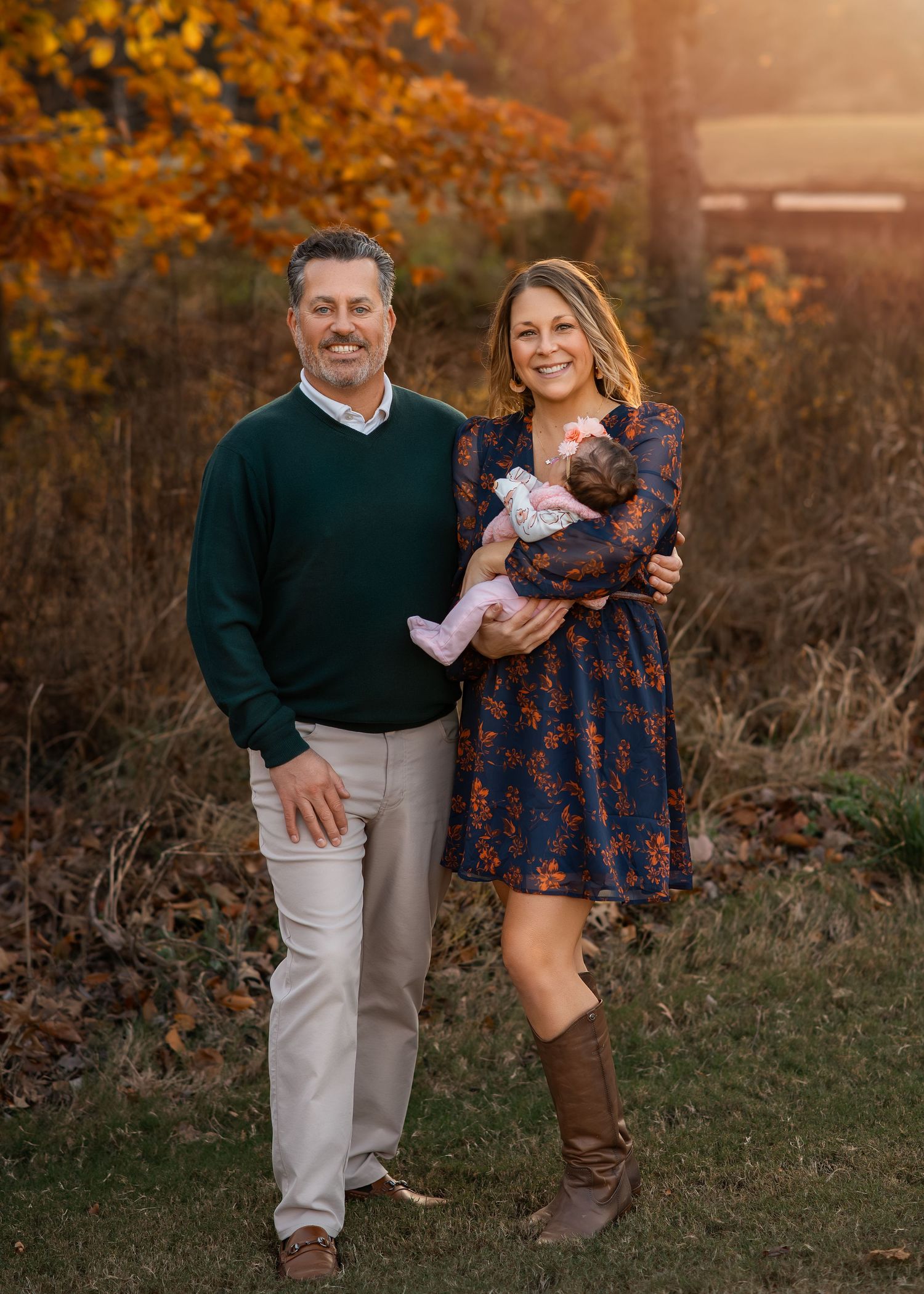
What you wear to your session plays a huge role in how your final gallery comes together, ultimately shaping the mood, colors, and overall feel of your portraits. Wardrobe choices can truly elevate your images or hold them back, so it’s worth choosing thoughtfully.
Your portrait session is about you and your family, not the clothing. The goal is to create images that feel natural, timeless, and focused on the connection between you. For example, while trendy pieces or party attire may be beautiful on their own, they can sometimes distract from the genuine moments and emotions that make your portraits meaningful.
A big part of my creative process is influenced by color, and I’m especially drawn to earthy, neutral tones. They photograph beautifully and complement the soft, timeless look of my work. For this reason, I encourage clients to choose simple, classic clothing in neutral tones that will continue to feel beautiful for years to come.
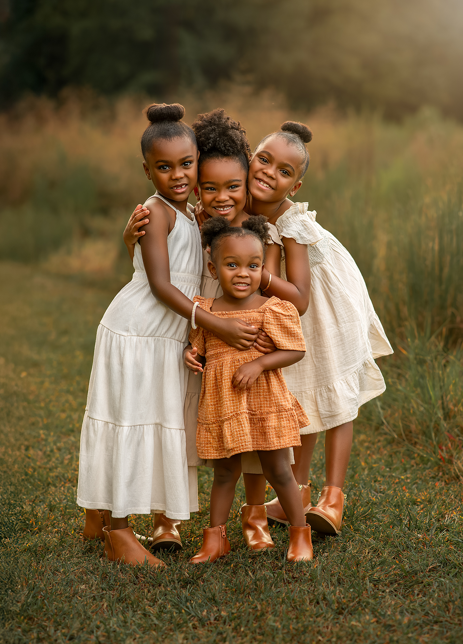
neutral tones
So, WHAT ARE NEUTRAL TONES?
Neutral tones are the foundation of a timeless, polished look in your photos. These colors are soft, natural, and easy on the eyes, helping the focus stay on your family and the emotion in the moment.
Think of colors you’d find in nature — nothing too bold or saturated. Neutrals blend beautifully with outdoor settings and flatter every skin tone.
WHY NEUTRALS PHOTOGRAPH SO WELL
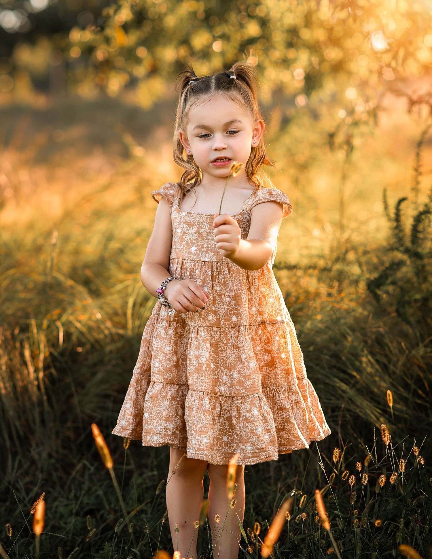
Neutral tones create a cohesive, elevated look across your images. They keep skin tones looking natural, avoid clashing with each other, and pair beautifully with green fields, fall colors, open shade, and golden hour light. They also age well, giving your photos a classic feel that will look beautiful in heirloom prints.
TIPS FOR CHOOSING NEUTRALS
- When mixing colors, try to keep them within the similar tonal range
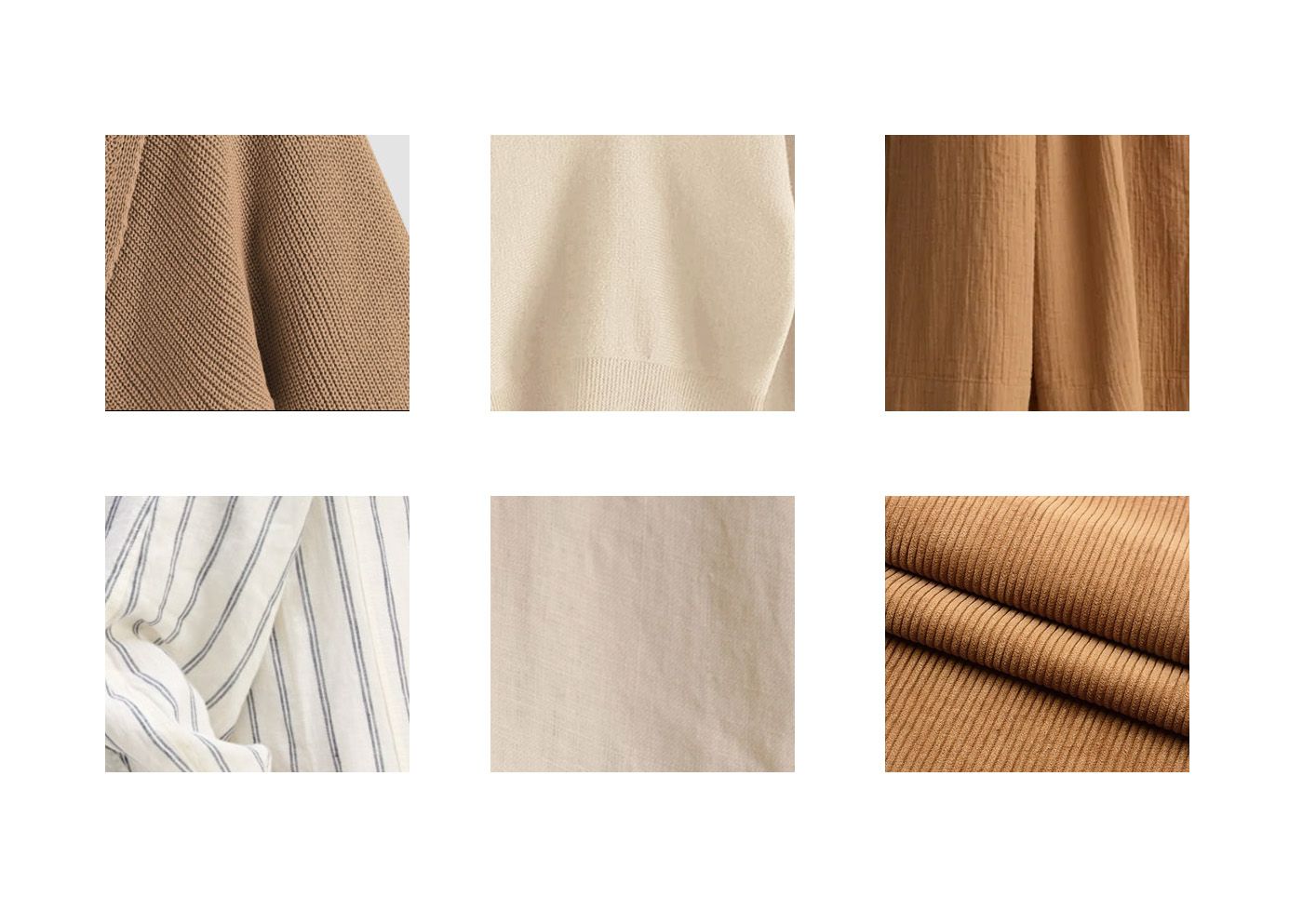
- Add texture through knits, linen, or ribbed fabrics to keep it interesting.
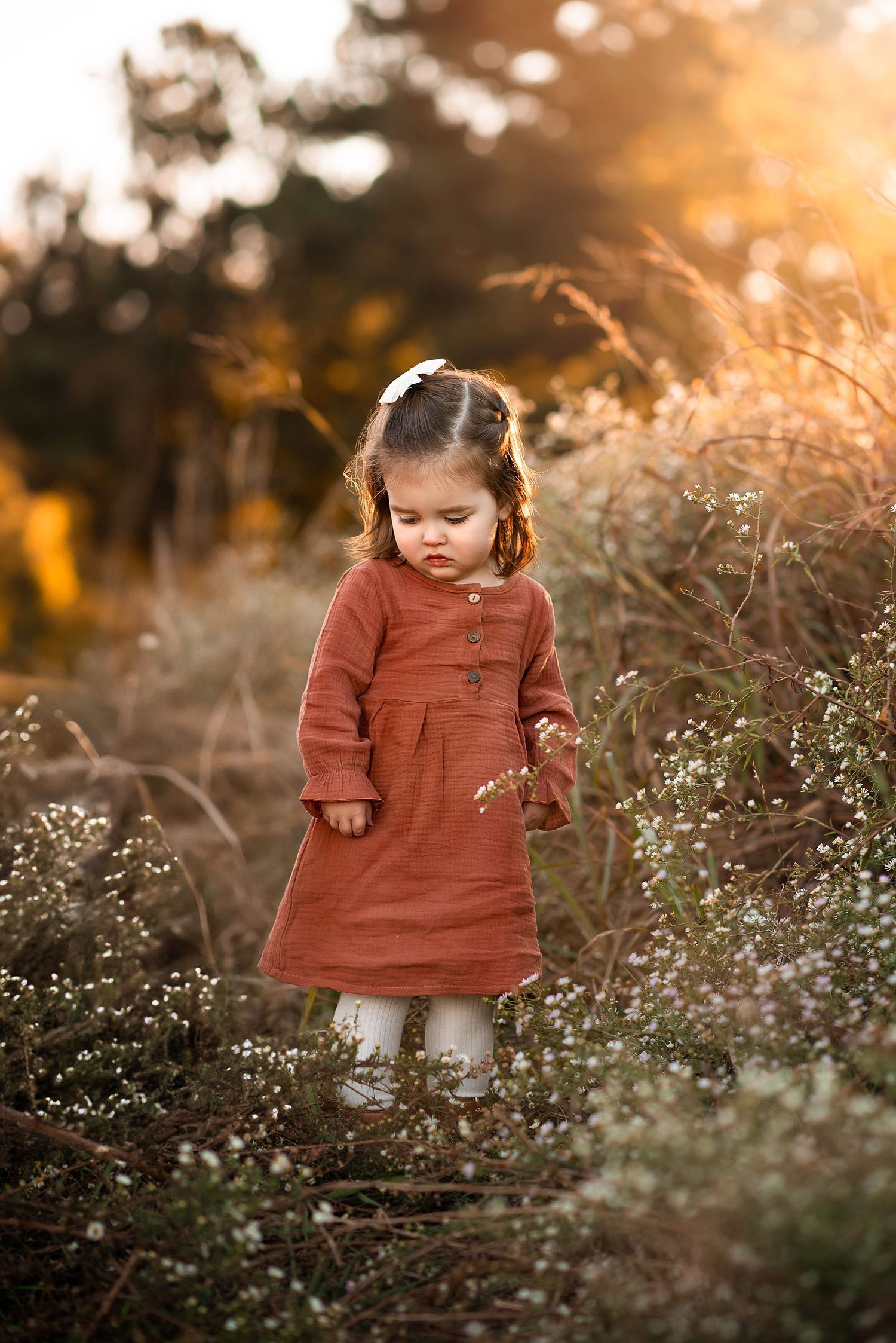
- Soft patterns (thin stripes, tiny florals, subtle plaids) count as neutrals if they’re not too bold.
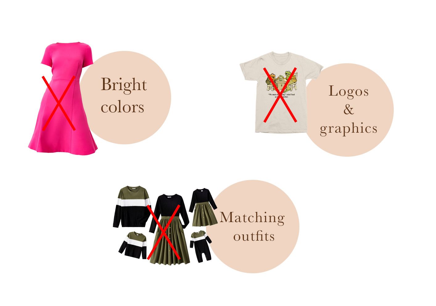
- Avoid neon or high-contrast and bright colors since they tend to reflect onto the skin. For example, a bright pink color clothing will reflect pink on your skin.
• Warm neutrals: cream, beige, oatmeal, tan, camel, warm browns
• Cool neutrals: gray, soft charcoal, muted sage, muted blues
• Earthy neutrals: olive, terracotta, muted rust, soft clay tones
• Light neutrals: ivory, soft white, taupe
• Dark neutrals: deep brown, forest green, olive greens, navy
Where to start
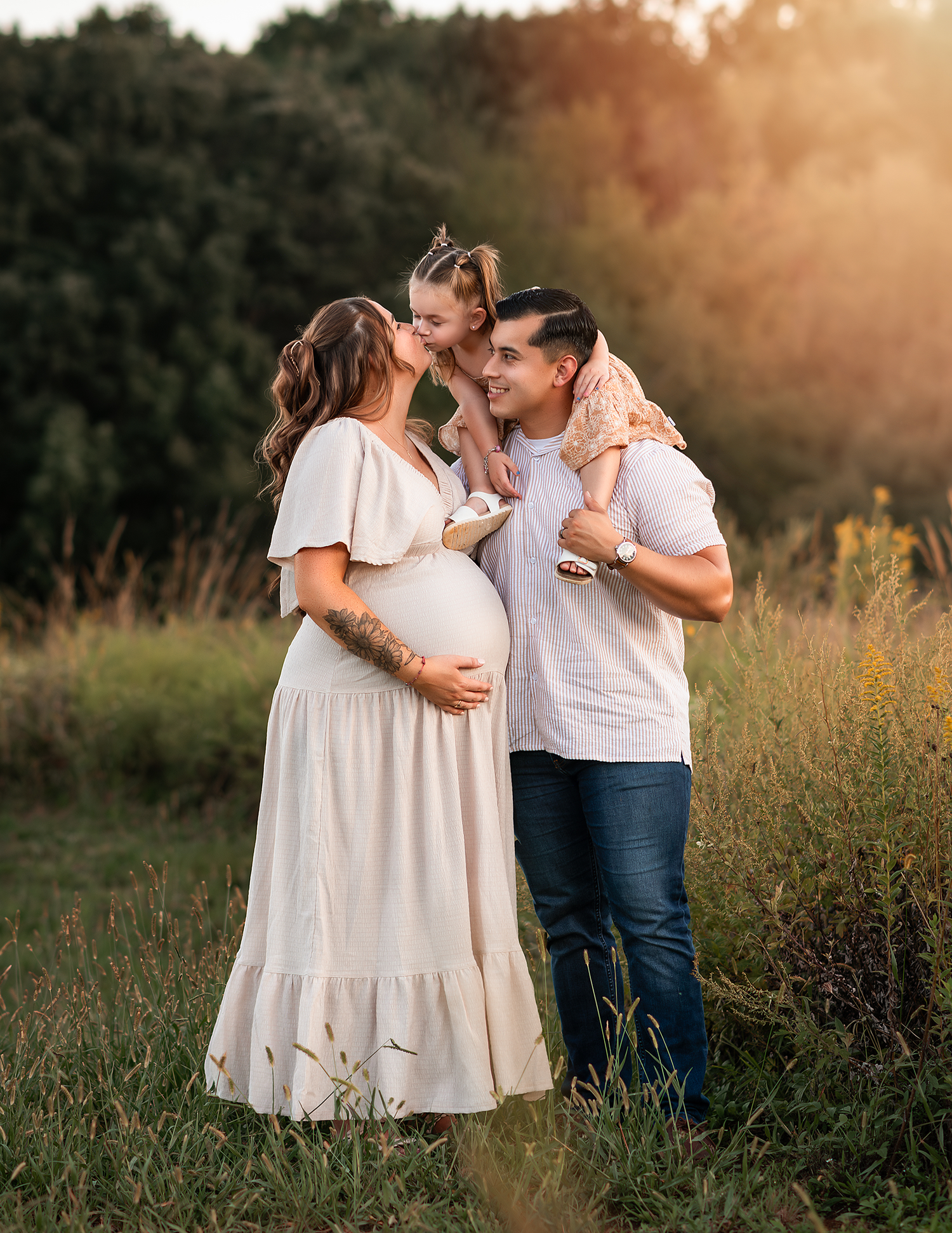
Begin by choosing the mom’s outfit first. I usually suggest coordinating the rest of the family’s looks based on what she’s wearing. It’s much easier to build a cohesive style this way. Let the parents set the tone and have the children's outfits complement theirs.
It's important to choose an outfit that makes you feel confident and fits you well, as well as something classic and timeless that also reflects your personal style, so the photos truly represent who you are.
Colors
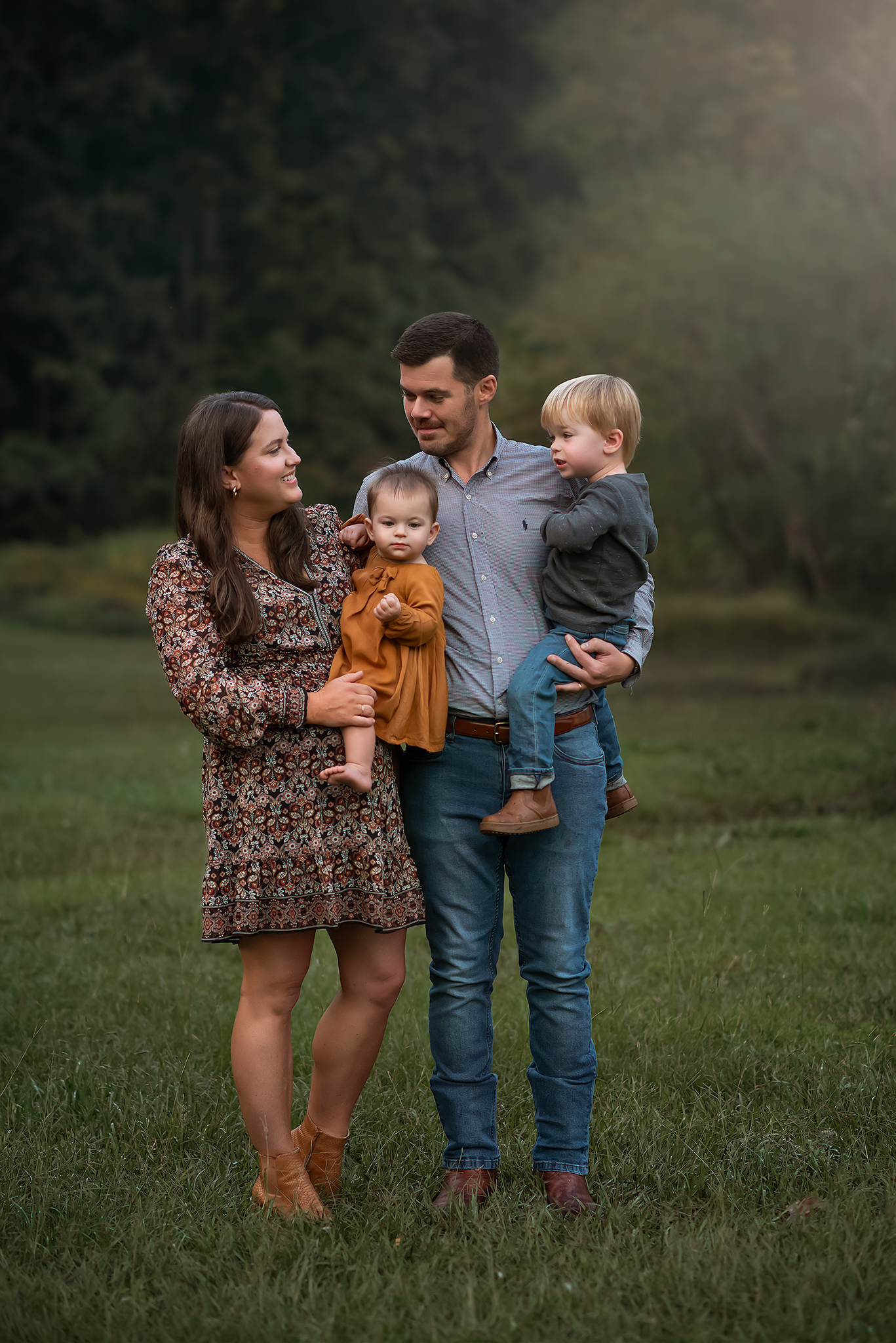
Try to avoid wearing matching outfits. While it might seem like a fun or coordinated idea, identical outfits can often blend everyone together in photos, making it harder to highlight each person's unique personality and style, resulting in lack of depth and visual interests in your photos.
Instead, opt for neutral tones that complement one another, while incorporating enough variation in your palette to create beautiful contrast. This helps prevent your photos from looking too monochromatic. You’ll find some sample color palettes below for inspiration.
It’s also best to avoid overly bright colors, as they can reflect onto your skin and affect the natural tones in your photos.
Black Clothings:
If you can, try to avoid wearing black outfits. While they’re classic and chic, black absorbs light and often photographs as a single dark shape, which can hide texture, detail, and flatten the overall look of an image. A good alternative to black is a darker grey, which keeps the same timeless feel while still allowing the camera to capture depth and dimension. Because so much of my work focuses on emotion, connection, and natural depth, clothing that shows movement and texture tends to complement the final images more beautifully. That said, your comfort and confidence always come first. Whatever you choose to wear, I’ll support you fully and make sure you look your best in your photos.
textures & Patterns
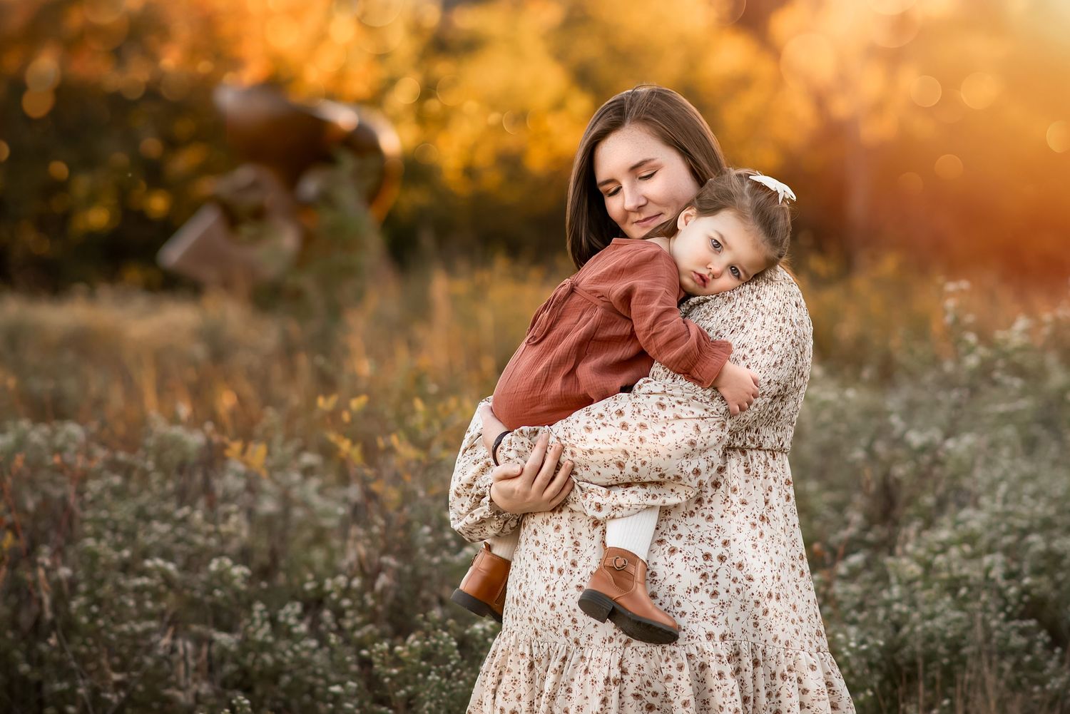
Incorporating textures and patterns is a fantastic way to add depth, movement, and visual interest to your photos.
That said, it's important not to go overboard—too many patterns can become distracting and take attention away from the genuine connections between your family members. As a general guideline, including one patterned outfit for every three people in the photo works well to create visual appeal without overwhelming the image. Subtle prints like small florals or stripes are great pattern choices.
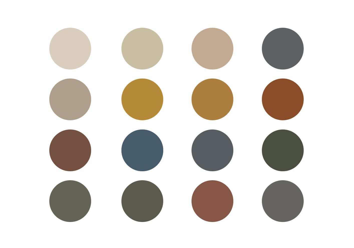
Color Palette
Neutral and earthy tones are subdued colors, and give your pictures a timeless look. Creams, soft tans, browns with any muted colors can create a cohesive look.
Textures
Outfits with textures gives visual interests and add depth to your images. Think of knits, linens etc.
pattern
Bold and busy patterns, and outfit with graphics and logos can easily overwhelm and take away from your family's connection and expressions. Instead, choose simple outfits with soft and muted color with subtle patterns.
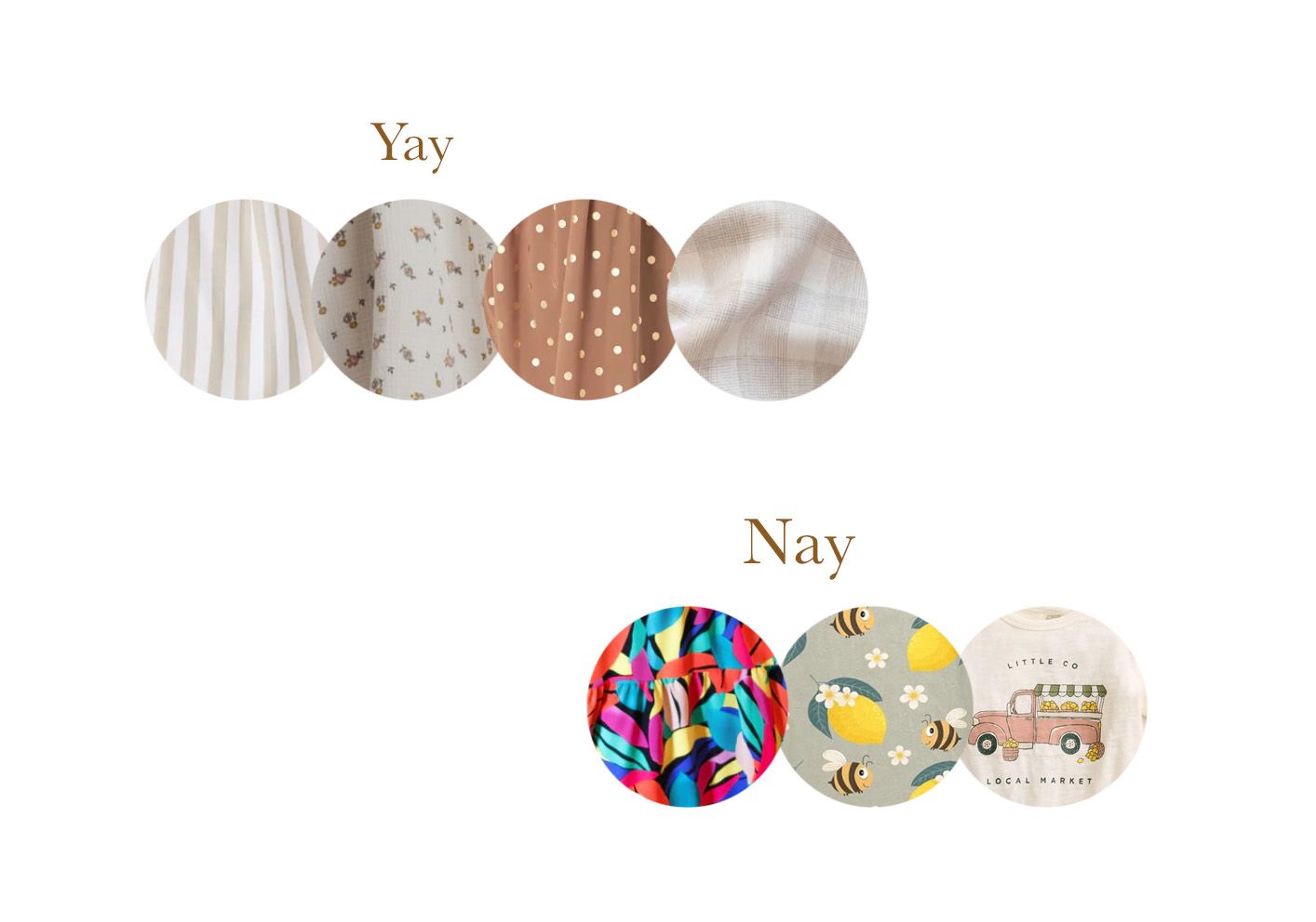
What NOT to wear
Try to void busy pattern and overly bright colors such as neon colors. Not only are brights colors distracting and affect other colors, but they can also cast colors on your skin. Avoid wearing matching colors/outfits and co-ordinate instead.
Get in touch